
Real-Time Occupancy Dashboards for Multi-Site Parking Operators
What it takes to build a real-time bay-occupancy dashboard that stays accurate across multiple sites: architecture lessons from a live 17-site deployment.

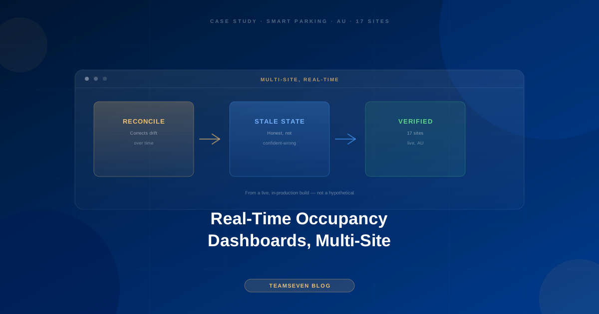
"Real-time" is one of those words that's easy to promise in a product spec and difficult to deliver correctly once you have multiple physical sites, unreliable network links, and a dashboard that operators are relying on to make decisions. We built the occupancy and management dashboard behind a smart parking automation platform now running across 17 sites in Australia, and the gap between "shows a number" and "shows the correct number, reliably, under real network conditions" is where most of the engineering complexity lives.
Why occupancy is harder to track accurately than it sounds
A bay is either occupied or it isn't: that sounds like a simple boolean. In practice, occupancy state is inferred from a stream of vehicle entry and exit events coming through the ANPR and gate system, and inference is where errors creep in.
Entry and exit events can arrive out of order, or not at all. A vehicle that tailgates another through a gate without triggering its own read, a plate read that fails on exit but succeeded on entry, or a network blip that delays an event's arrival at the central system: any of these can leave the occupancy count silently wrong if the system isn't explicitly designed to reconcile against reality.
Multi-site aggregation compounds the problem. A dashboard showing occupancy across 17 sites isn't just displaying 17 independent numbers: operators need to compare, aggregate, and spot anomalies across sites, which means the underlying event data has to be normalized and timestamped consistently even when individual sites experience different network conditions or brief connectivity drops.
A dashboard that's occasionally wrong is worse than one that's occasionally slow. Operators make real decisions off this data: directing traffic to a site with available capacity, flagging a site that looks anomalously full, verifying billing disputes. A confidently-displayed wrong number erodes trust in the whole system faster than an honest "reconnecting" state does.
What we built to keep the numbers honest
Periodic reconciliation, not just event-driven counting. Rather than trusting a running count derived purely from entry/exit events (which drifts if any event is missed), the system periodically reconciles against a more authoritative source (where available, that includes physical sensor data or scheduled audits) and corrects drift rather than letting a small miscount compound silently over hours or days.
Explicit "stale" and "reconnecting" states, not silent staleness. If a site's connection to the central system degrades, the dashboard shows that site's data as stale rather than continuing to display a last-known number as if it were current. This is a deliberate UX decision: an operator seeing "data 4 minutes old, reconnecting" makes better decisions than one seeing a confident number that's quietly wrong.
Site-level and portfolio-level views, built from the same underlying data. A single-site operator needs bay-by-bay detail; a portfolio manager overseeing all 17 sites needs aggregate trends and anomaly flags. Building these as two separate systems querying two different data models is how dashboards drift out of sync with each other. We built one event pipeline and two views over it, so the numbers are always consistent between the site-level and portfolio-level dashboards by construction, not by careful manual syncing.
Real-time where it matters, near-real-time where it doesn't. Not every part of the dashboard needs sub-second latency. Gate-side decisions (is this vehicle authorized to enter right now) need to be real-time. A portfolio-level occupancy trend chart updating every 30 seconds instead of instantly costs nothing in practical value and meaningfully reduces the engineering complexity and infrastructure cost of the system. Being deliberate about which parts of "real-time" need to be instant is a scoping decision that saves real budget.
The infrastructure decisions that make this hold up across sites
Running reliably across 17 physically distinct sites, not one data center serving one location, means designing for the reality that any individual site's network connection can degrade independently of the others. Each site's local systems (the ANPR pipeline, the gate controller, local event buffering) are built to continue operating correctly even during a temporary loss of connection to the central dashboard, queuing events locally and syncing once connectivity restores, rather than depending on a constant live connection to function at all. This is the difference between a dashboard that's occasionally behind and a parking operation that stops functioning the moment one site's internet has a bad afternoon.
The generalizable lesson
Any "real-time" dashboard over physically distributed, hardware-sourced data hits the same category of problem: events can arrive late, out of order, or not at all, and the dashboard's job is to be honest about what it knows rather than papering over gaps with a confidently displayed but potentially stale number. Reconciliation, explicit staleness states, and being deliberate about which parts of the system need sub-second latency versus which can tolerate a short delay. That's the actual engineering behind "real-time," and it's mostly invisible until it's missing.
Stay connected
Build notes, launches, and new articles from the Teamseven team.