Rebuilding a Global Legal Network's Platform: How We Built the Employment Law Alliance's Find a Lawyer & Handbook Experience
How we redesigned Employment Law Alliance's platform: a Find a Lawyer engine and Global Employer Handbook for 3,000+ lawyers across 170+ jurisdictions.

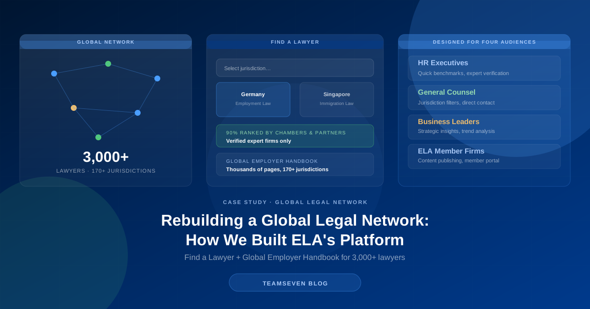
Most B2B platforms have one job: get a single type of visitor to a single type of action. Employment Law Alliance doesn't have that luxury. It's the world's largest network of independent labour and employment law firms (more than 3,000 lawyers across 170+ jurisdictions and five global regions) and its platform has to serve an HR executive in Chicago, a general counsel in Singapore, a business leader scoping EU expansion, and the network's own member firms, often on the same day, without any of them feeling like an afterthought.
We redesigned and rebuilt that platform, now live at ela.law. This is the honest story of what it takes to design for genuine information-architecture complexity (a global network, four distinct audiences, and a content library measured in thousands of pages) without the result feeling like a database with a skin on it.
What does a global legal network's website need to do?
A network like ELA sells trust and specificity at the same time, and its platform has to prove both. Trust, because an HR executive choosing outside counsel in a jurisdiction they don't operate in day-to-day is making a real risk decision. They need to see that ELA's member firms are vetted (90% of ELA firms are ranked by Chambers and Partners and other prestigious organisations) and local. Specificity, because "we have lawyers everywhere" means nothing until someone can find the right lawyer for German labour law, or Vietnamese immigration law, or a specific type of employment dispute in Brazil, in a few clicks, not a phone call to a member services desk.
The platform's two core jobs follow directly from that: a Find a Lawyer discovery engine, and the Global Employer Handbook: a comprehensive reference on labour, employment, and immigration law across every jurisdiction ELA covers. Everything else on the site exists to support one of those two things.
Why did we design for four audiences instead of one?
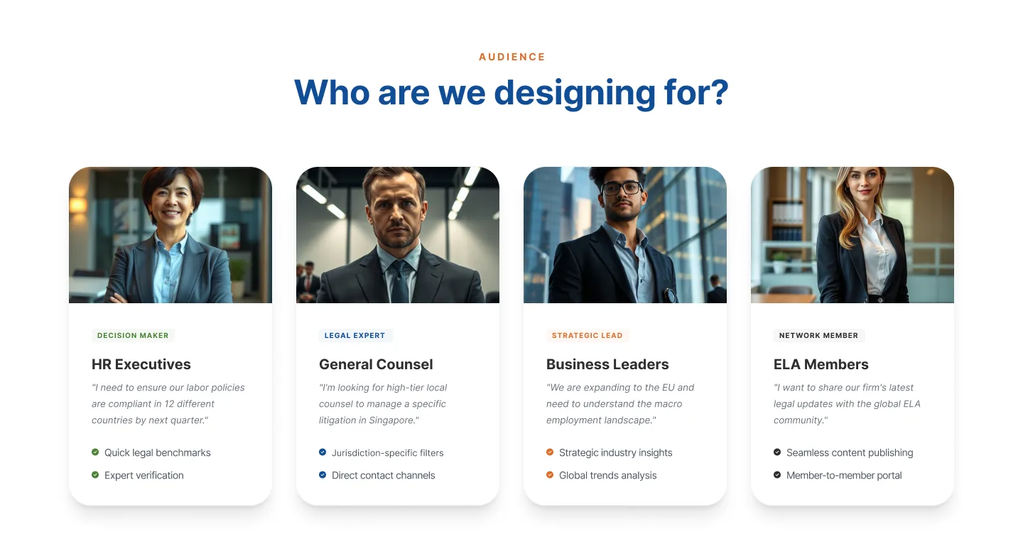
The previous experience treated "find a lawyer" as a single generic search. It wasn't wrong, exactly. It just assumed every visitor has the same intent, and they don't. We mapped ELA's real audiences and designed each one a distinct path through the same underlying network:
HR Executives need quick legal benchmarks and expert verification: "I need to ensure our labour policies are compliant in 12 different countries by next quarter" is a completely different search than a single-jurisdiction lookup. General Counsel need jurisdiction-specific filters and a direct contact channel, they already know what they're looking for and want to reach a named person fast. Business Leaders scoping expansion need strategic industry insights and macro trend analysis before they need a specific lawyer at all. And ELA's own member firms need a network member experience: seamless content publishing and a member-to-member portal, because the platform also has to work for the 3,000+ lawyers inside the network, not just the buyers coming to it.
Designing four real audiences into one coherent site is a different exercise from designing one persona four times with different copy. Each group's entry path into the platform had to reflect what they came to do, while all four still landed in the same underlying network of verified firms.
Two flows, mapped before a single screen was built
We mapped the platform's two primary user journeys in detail before any UI work started, because getting the sequence right mattered more than getting any individual screen right.
The "Find a Lawyer" path: landing page → select jurisdiction → find a lawyer → browse experts → select lawyer → view profile → contact. Jurisdiction comes first, deliberately: an HR executive's mental model starts with "where," not "who," so the flow follows that order instead of dropping a generic search box on the homepage and hoping filters catch up.
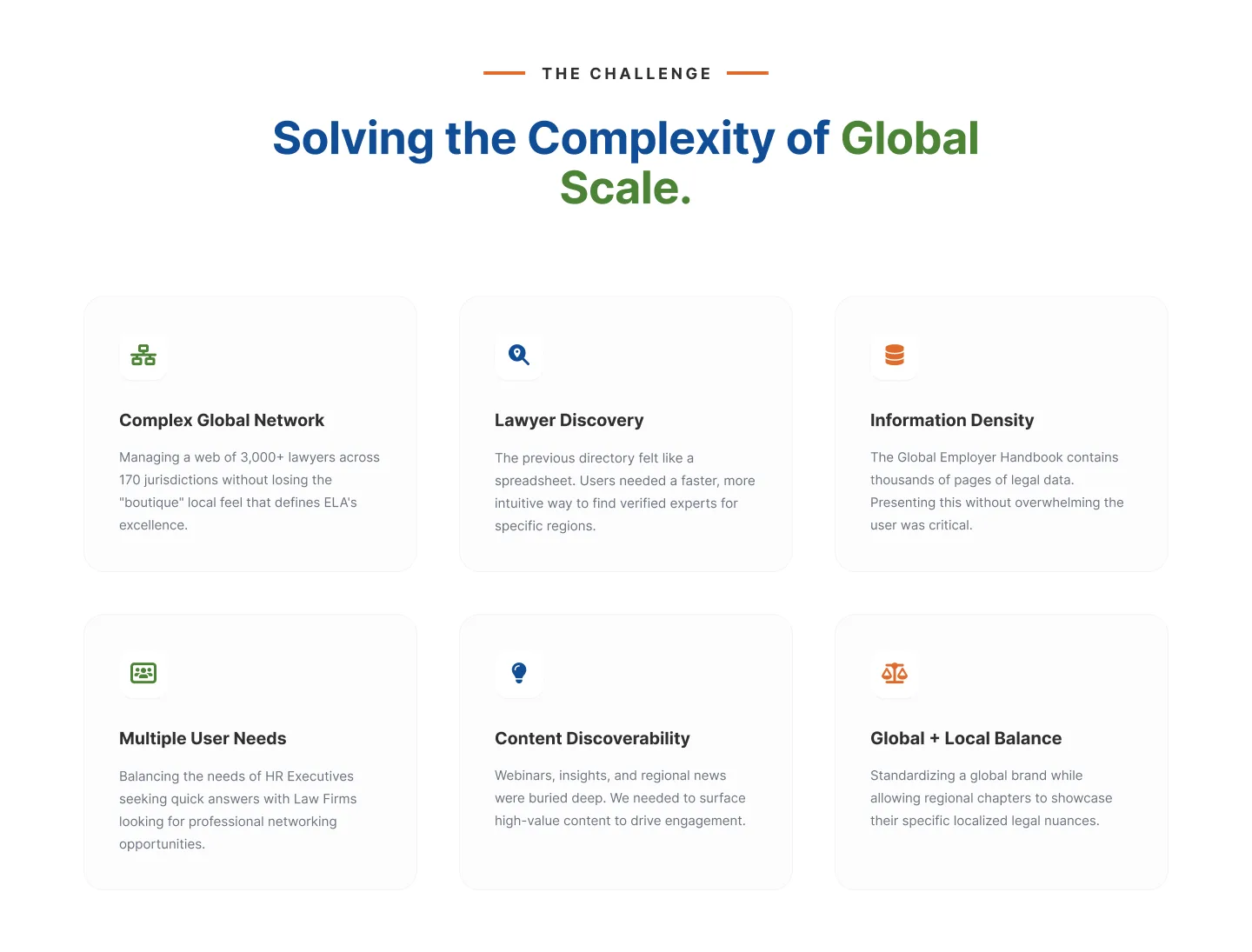
The "Employer Handbook" discovery path: landing page → open handbook → select jurisdiction → select topic → search/filter → view info. This is the harder design problem of the two, because the Handbook itself is enormous: thousands of pages spanning 170+ jurisdictions, maintained by the member firms who practise in each one. Present that density on one page and you get something that reads as intimidating rather than authoritative. We built the discovery path around progressive narrowing instead: jurisdiction, then topic, then search, so nobody has to see 170 jurisdictions and every topic at once. They see their jurisdiction and their topic, fast. This is the same principle behind designing for complex content libraries generally: density is a feature of the underlying content, not something the interface should ever force on the user all at once.
One global brand, without flattening 3,000 local firms
The hardest brand problem on this project wasn't visual. It was structural. ELA needed one credible global identity, consistent enough that a visitor landing on any regional or member-firm page instantly recognises it as ELA. At the same time, every one of those member firms needs to show the local expertise and personality that makes it trustworthy in its own market, a firm in Latin America has a different voice, different regional statistics, and different jurisdiction-specific nuance than a firm in Asia Pacific, and none of that can get lost in the name of consistency.
We solved this by building a single shared visual system (colour, iconography, page templates) and applying it consistently everywhere, while keeping regional and local content structurally prominent within that shared frame rather than reduced to a generic template with a logo swap. Each region's statistics, each firm's specific expertise, each jurisdiction's local nuance are still front and centre. They're presented through the shared system, not overridden by it. Standardise too hard and the local firms lose their voice; standardise too little and the network stops reading as one thing. Getting that balance right is the actual craft in designing a platform for a multi-entity organisation, legal networks, franchise groups, professional associations: where the brand has to be one thing and many things simultaneously.
Making a content library feel like a resource, not an archive
The Global Employer Handbook is ELA's flagship asset and its biggest usability risk in the same breath: thousands of pages of jurisdiction-specific labour and employment law, valuable precisely because it's comprehensive, unusable if comprehensive means overwhelming. We treated content discoverability as a first-class design problem rather than a search-bar afterthought: webinars, insights, and regional news were previously buried deep in the site; we rebuilt content surfacing so high-value material (on-demand webinars, thought leadership, jurisdiction updates) reaches the people who'd want it, instead of existing three clicks past where anyone looks.
We also gave social proof its own proper treatment: a Client Success Stories section carrying logos including Nestlé, Tesla, and Umbra, built to communicate the weight a network this size deserves rather than a token testimonials carousel. And the network's own statistics (5 regions, 3,000+ attorneys, 100+ countries, 90% of member firms ranked by Chambers and Partners) are surfaced as first-class homepage content, not buried in an About page, because those numbers are the pitch for a network business.
What building for a global network taught us
Multiple audiences need multiple paths, not one search box with more filters. The instinct to build one generic "search everything" experience is efficient to build and frustrating to use whenever your visitors want different things. Mapping HR Executives, General Counsel, Business Leaders, and Member Firms as real, distinct journeys, not just personas in a slide deck, is what made the redesign work.
Progressive disclosure is the only honest answer to genuine content density. You cannot design around thousands of pages of jurisdiction-specific legal content by making the search box smarter. You design around it by narrowing the path (jurisdiction, then topic, then result) so the user never has to confront the full scale of the library at once.
A global brand and 3,000 local voices aren't in tension if you design for both from the start. The failure mode is treating brand consistency and local specificity as a spectrum where you pick a point. They're not opposed: a shared system that keeps local content structurally prominent gets you both.
Scale that isn't visible on day one is still worth designing for. ELA's platform has to accommodate new member firms and new jurisdictions on an ongoing basis. Architecture that only works for the network's current size is architecture you'll be rebuilding within a year.
Thinking about building a platform for a global network or multi-firm organisation?
If your platform has to serve different audiences at large content scale (a professional network, a franchise group, a multi-region B2B SaaS product) the design problem isn't features, it's information architecture: which paths does each real audience need, and how do you keep local identity intact under one shared system. That's the work we did on ELA.
We build web and SaaS platforms for organisations with real structural complexity (global networks, multi-tenant B2B products, and regulated industries) and we're happy to give you an honest read on your platform's actual complexity before anyone quotes a number. If that's the conversation you need, tell us what you're building.
ELA's network spans 3,000+ lawyers across 170+ jurisdictions, with 90% of member firms ranked by Chambers and Partners: now presented through a single global platform live at ela.law. Read the full case study →
Stay connected
Build notes, launches, and new articles from the Teamseven team.